Although the terms graphic and image are often used interchangeably, they actually refer to two different things. Graphic refers to any type of visual presentation that is displayed on a physical surface. This includes symbols, numbers, drawings, typography, and web buttons. However, image refers to a two- or three- dimensional representation of a person, object, animal, or scene. Because they can be still or moving, images range from photographs and charts to broadcast television and digital video. One main difference between the two is that graphics remain still and images can be moving.
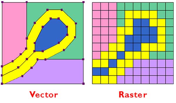
Raster images and Vector graphics are the two main methods for displaying graphics. Raster images are composed of pixels (little tiny squares of color), while Vector graphics are defined using paths (geometrics areas defined by curves and lines). They have many differences including editing software (raster uses apps such as Adobe Photoshop and vector uses those such as Adobe Flash and Illustrator), output channels (raster primarily uses low-resolution electronic display, digital photography, video, and web pages; vector uses high-resolution printing and prepress applications), file size (raster is typically large and vector is typically small) and scalability (raster are resolution-dependent and vector are resolution-indepenedent). Raster images major downfall is their lack of scalability because of their use of pixels. Vector images are beneficial because of their ability to enlarge or shrink due to their lack of pixels and also they are naturally anti-aliased.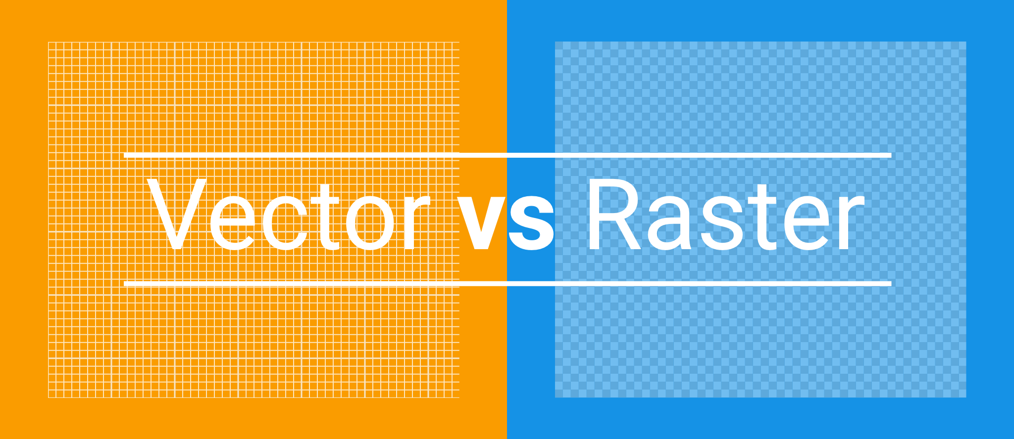
Upscaling raster images often ends up with a very noticeable lack of image quality, and therefore, should be avoided.
Raster images are naturally aliased, which means that the edges of their curved lines are visibly jagged. It appears like a stair-step because of the square pixels trying to produce a curved effect. Anti-aliasing softens the edges by blending the colors of the pixels. However, it does increase the file size. Anti-aliasing isn't necessary for vector images, because their lines' edges are already smooth since their lines are naturally without jaggedness.
Comments
Post a Comment