Navigation Examples


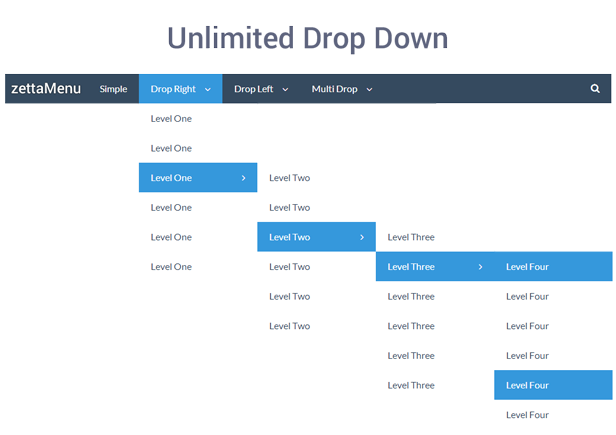
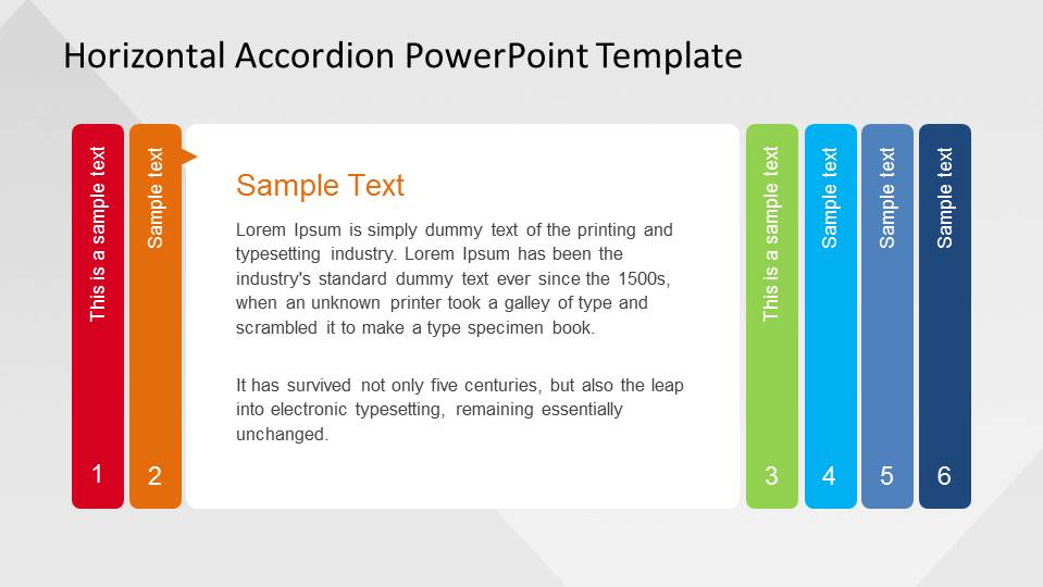
The following are examples of three of the most common navigation styles.
  • vertical dropdown menu
(the book shows it as the top two images but everything on the internet says that vertical dropdown menus look more similar to the below image)Image result for vertical drop down menu
  • horizontal dropdown menu
Image result for horizontal drop down menu
  • accordion menu
Image result for accordion menu horizontal

Comments

Popular posts from this blog

Which Microphone to Use?

In what scenario should the following microphones be used? Handheld A handheld microphone is best for performers or news reporters.  They can easily handle the microphone, and it can capture their voice accurately, while avoiding picking up background noises. Lavalier The lavalier microphone is ideal for speakers who talk with their hands or hold props while talking, and therefore can not hold a microphone.  These also work great for actors who need their microphone hidden. Shotgun This type of microphone is best for filming a movie scene, positioned over people having a conversation. Boundary (or table) mic These microphones are often set on tables in podcasts or sit down style youtube videos.  Not only are they incredible effective, but also quite efficient because you can plug them into a laptop USB to easily record audio.

Camera Angles

The following are photos I've taken that exemplify different camera angles.   Establishing shot Wide shot Medium shot Close-Up Extreme Close-up Over the shoulder shot Proper lead-room (or nose-room) Proper headroom Bird's eye view High Angle Neutral Angle Low Angle Worm's view

Visual Hierarchy

A page consisting of simply one huge column of uniform and equally spaced text fails to interest and entertain the viewer as successfully as a page with visual hierarchy does.  Visual hierarchy is essentially the order that the viewer processes the content on a page.  It sets apart words, phrases, and paragraphs so that the content can be easily processed by its viewers.  Alignment, color, images, headers, etc. add emphasis to visual hierarchy, making the important information more clear and obvious while the less essential information becomes smaller and less impactful. USA Today's website contains interesting visual hierarchy.  This makes it a joy to use because not only is it aesthetically pleasing but also the content flows easily and clearly.